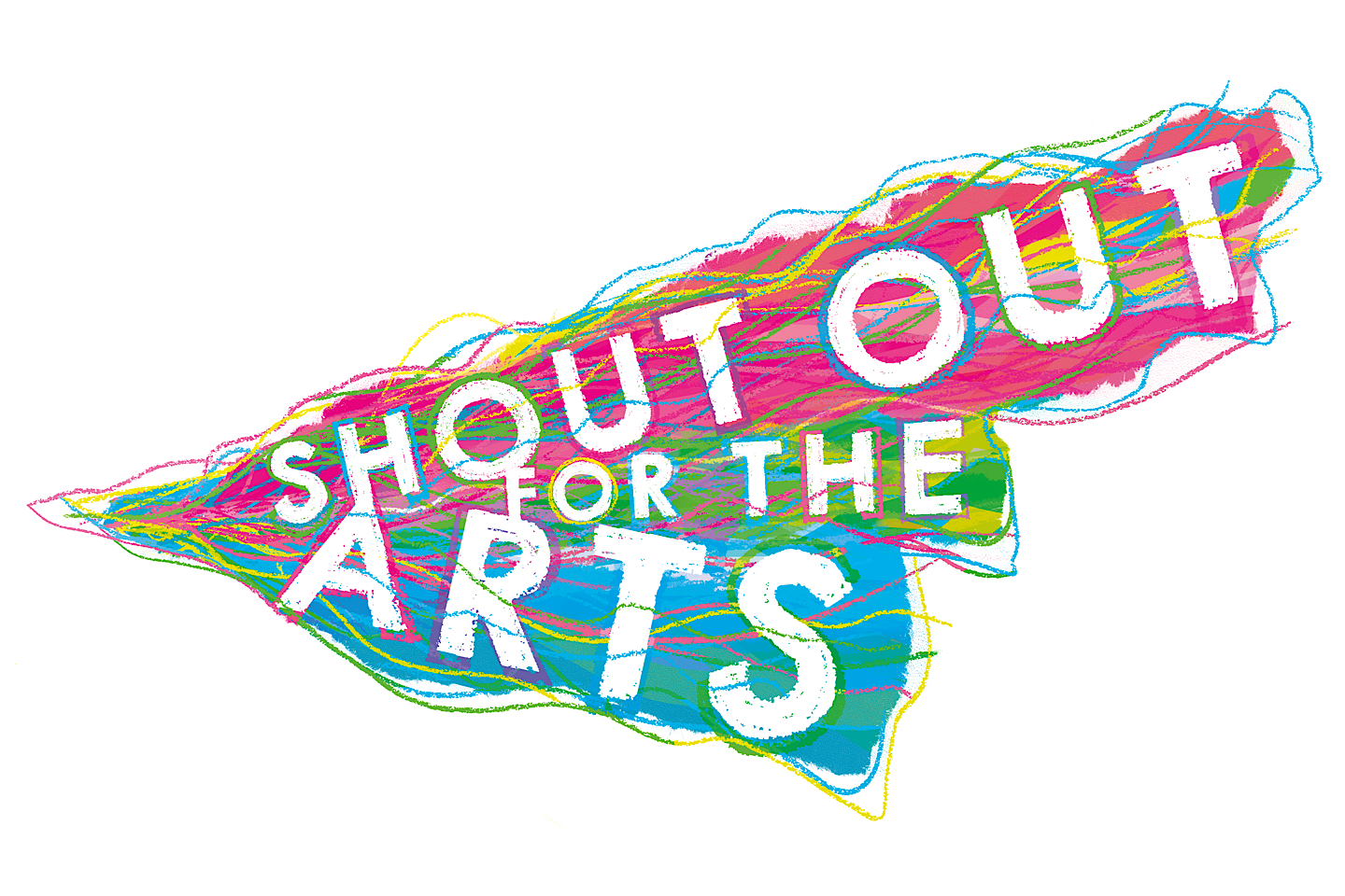
Just under a year ago, members of the Shout Out For The Arts Youth Board met to finalise the new Shout Out For The Arts logo.
In October 2021, they met digitally with members of the Adult Board, as well as RSC Graphic Designer Graham to work with him on the final design for this project.
In advance of the virtual get together, Youth Board members had researched logos they liked and some even designed some themselves.
Before the meet, the board also created four clear points
Make sure the logo isn’t too corporate, has a homegrown feel. Using Saanvi’s initial art work.
Look at the more dominant words in the logo, which can be most emphasised– Arts and Shout.
3 or 4 main colours rotated throughout the logo. Would be consistent with a brand.
The shape of an ear with soundwaves as a basis for a logo, which makes an interesting shape. Then the soundwave lines showing communication. These waves could be wavy or straight.
MAKE SURE THE LOGO ISN’T TOO CORPORATE, HAS A HOMEGROWN FEEL USING SAANVI’S INITIAL ART WORK.
LOOK AT THE MORE DOMINANT WORDS IN THE LOGO, WHICH CAN BE MOST EMPHASISED– ARTS AND SHOUT.
3 OR 4 MAIN COLOURS ROTATED THROUGHOUT THE LOGO. WOULD BE CONSISTENT WITH A BRAND.
THE SHAPE OF AN EAR WITH SOUNDWAVES AS A BASIS FOR A LOGO, WHICH MAKES AN INTERESTING SHAPE. THEN THE SOUNDWAVE LINES SHOWING COMMUNICATION.
THESE WAVES COULD BE WAVY OR STRAIGHT.
When they met on Zoom, they discussed which logos they liked and why, and most importantly, talked about what the Shout Out For The Arts logo needed to say.
“It was a really strong process,” said Sophie XXX, “We all met during lockdown so even though we missed being face-to-face, the session worked so well online. We had chatted to the Youth Board beforehand to ensure they felt comfortable instructing an adult designer and they did fantastic. They really did feed back to Graham and he could take away their ideas and form something that really encompassed what the project is all about.”
Many changes were made as the design journey progressed – the shape, the colours, the font and the individual elements included in the logo. Via the Zoom session, Graham showed the Board different variations he had mocked up himself. He had behun designing
We believe we should be listening to young people about what they want to access in arts, culture and heritage and how they want to access it.
and they fed back on what should change. A few months, meeting and different variations later, the new and final logo was born.
HAND DRAWN ELEMENTS TO GIVE CRAFTED, ORGANIC FEEL.
ENERGETIC; PLAYFUL; FUN; ARTSY; IMPACTFUL.
VIBRANT COLOURS REMINISCENT OF A RAINBOW WITHOUT DIRECTLY PORTRAYING A RAINBOW.
HIGH RESOLUTION TITLE POSITIONED ON RECOMMENDED WHITE BACKGROUND.
“Insert quote from Graham”
Insert quote from Saanvi


